Two years ago, BlackBerry finally broke free of the
monotonous cycle it had entrenched itself in by launching its first
all-touchscreen device, the Z10. Despite it being a costly flop,
the company formerly known as RIM has continued to explore touchscreen
territory with the help of its poke-friendly BB10 OS. BlackBerry is no
longer a stranger to the form factor: It quickly followed up the Z10
with the Z30, and now the new BlackBerry Leap.
There's little that separates BlackBerry's three main touchscreen
devices as far as internals are concerned, and therein lies the main
problem with the Leap. Instead of trying something different, BlackBerry
has kept well within its comfort zone and pushed out another mid-range,
touchscreen handset that's marginally divergent from its predecessors.
Don't get me wrong: If a Leap lands on your desk to replace an old work
phone, you'll no doubt get on with it just fine. But, if your own money
is on the table, you're probably going to want to take it elsewhere.
There are
several things to like about the BlackBerry Leap, including its long
battery life, surprisingly good camera and the productivity afforded by
BB10 OS. The handset isn’t without issues, though. It can be cumbersome
to use due to its size; its 720p display is of substandard quality; and
even some of the most popular apps aren’t available on the BB10 platform
directly. And, almost unforgivably, the phone makes do with aging
internals, making it identical on the inside to the two-year-old
BlackBerry Z10. Frankly, it’s impossible to recommend the Leap over
cheaper handsets with superior specifications and more consumer-friendly
platforms. As a work phone, the Leap will more than cut it, but if
you’re looking for a personal device that isn’t solely for keeping up
with email, you can do better.
Hardware
BlackBerry isn't known for inspired design. The recent keyboard-toting Classic is almost an admission of that, it being a regression for the company; an homage to the Bold devices that found popularity many moons ago. Even the Porsche Design collaborations, the pocket-stretching Passport and the as-yet unreleased, curved-screen slider
are all variations on a weary theme. That being said, the new Leap is
at least a stark change from the two touchscreen BlackBerrys that came
before it. The company isn't exactly breaking the mold, though: The Leap
takes more than a few design cues from the BlackBerry Z3, a lower-end touchscreen device that has only been released in a few developing markets.
Distancing itself from the soft curves of the Z series,
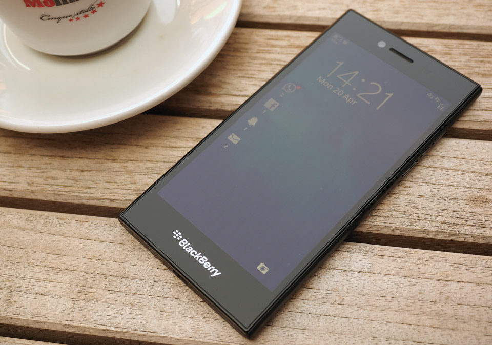
the Leap is a real blunt object of a phone. It's a black and gray slab
with sharp corners, meant for serious business, and I can't help but
find it lacking in character -- unless that character is a middle
manager at a logistics conglomerate. There are positives and negatives
to this "all work, no play" design. On the one hand, it looks and feels
like you could hammer nails with it. That's to say it's solid as a rock,
to the extent that the body won't flex or twist, even under
considerable pressure. The build quality is admirable: All the parts fit
together snugly, though the seams around the glass frontage are prone
to trapping dust and lint. Also, the dimpled, rubbery material that
covers most of the device feels like a built-in shock case, giving the
impression that the handset can shrug off a fall or two.

On the other hand, however, the Leap being a solid square
block makes it a tad cumbersome in the hand. Sure, the dimpled back,
with its slight curvature as it meets the sides, gives ample purchase
and comfort; but, the device is tall, wide, thick and verging on heavy
at 170g (six ounces). The Leap's 5-inch display is flanked on all sides
by healthy bezels, and while my spidery hands didn't struggle to
manipulate the device, my thumb was always leaning over dead
space to get at the screen. I was constantly shifting my hand position
so my thumb could reach the edges of the display, primarily because the
BlackBerry 10 OS is centered around several swiping gestures that have
to start off-screen. This serves to reinforce the feeling that the Leap
is huge for a 5-inch device; the power button's central placement on the top edge next to the headphone jack doesn't help much either.
The volume rocker -- or rather, the two volume keys on either side of the BlackBerry Assistant
button -- is more sensibly placed toward the top of the right edge, and
the micro-USB port is exactly where you'd expect at the base of the
device. Since the Leap's back panel is fixed (the battery is
nonremovable), the micro-SIM and microSD slots are hidden behind a panel
on the left edge. Beyond the usual buttons and holes, BlackBerry's
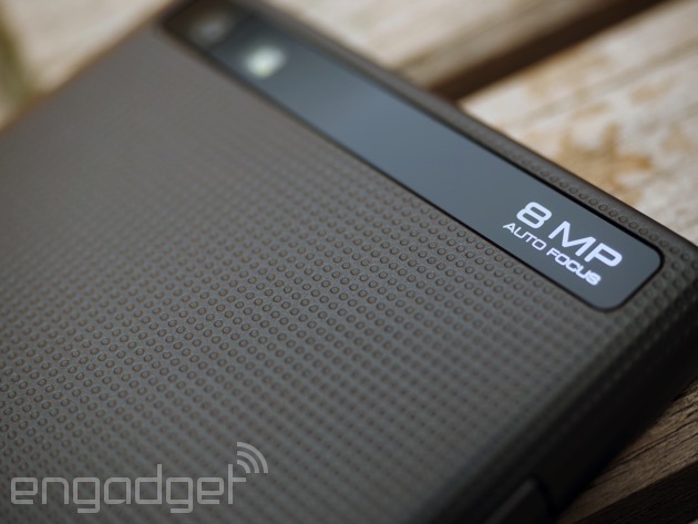
added some subtle accents here and there. The back has an industrial
look to it, with the dimpled gray canvas highlighted by a square,
punched-out loudspeaker grille, sunken silver BlackBerry logo and glass
band covering the camera lens, announcing its specifications in
futuristic font. The front-facing camera and earpiece are joined by a
large, red notification LED on the face of the device that screams,
"Check your phone," and another silver BlackBerry logo (this time with
the name alongside it) sits below the display.
None of these are unwelcome touches, but they don't
combine to make the Leap anything more than indistinctive. If the
handset didn't feel so big, the grand design might blend better with the
utilitarian nature of the device. But, being a little awkward to use
with one hand, it doesn't seem like a more striking look was sacrificed
in the pursuit of enhanced productivity.
Display

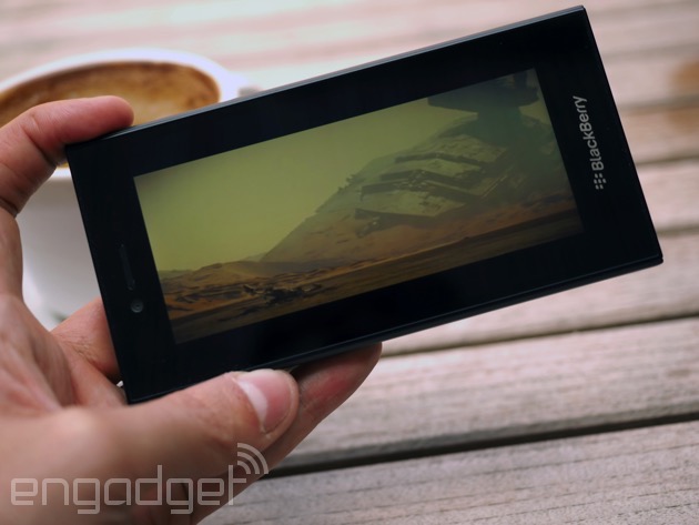
The Leap has a 5-inch, 1,280 x 720 (720p) LCD display,
which is nothing abnormal for a mid-range device at this price point.
(In fact, I would be surprised if the numbers were any different). I'm
not a great believer in huge pixel counts making a massive difference to
user experience on small screens, but I appreciate a good quality
panel. Alas, the Leap's display left me wanting. Colors are vibrant
enough and the white balance setting spot on, although you can adjust
this in the settings if you feel otherwise. Blacks are of the depth
typical to LCD displays, which is to say good, but not as vacuous as you
see with AMOLED technology. When I'm on a particularly dark screen, I
can pick out areas along the perimeter where light is bleeding onto the
display. My review unit's screen is particularly ill-fitting in the top
left-hand corner, although the uneven lighting is barely noticeable with
brighter colors.
Viewing angles are passable, but sunlight readability is
where it really lets itself down. The display's lacking the kind of
power you need to cut through direct rays, and there appears to be no
difference between 50 percent brightness and full whack when the sun's
beating down on the glass. It's not completely unreadable -- you'll
still be able to follow a map, read a tweet or just about frame that
picture through the glare -- but it's just not enjoyable having to
squint and spin around in search of the shade of your own shadow.
Software
The Leap runs BlackBerry 10. Build 10.3.1 of the OS, to be
exact, like the BlackBerry Classic. Even if you've had no prior
experience with BB10, you should find it vaguely familiar all the same,
although it relies more heavily on gestures than other mobile operating
systems. You'll see a plain home screen when you unlock the device; a
swipe to the left will bring up your app grid. Gesturing becomes
important when you're actually running an app, and swiping up from the
bottom bezel will effectively minimize what you're looking at and pin it
to the home screen, which doubles as your task manager. It means you
can quickly get at your most used apps and see what's running in the
background. And kinda like Windows Phone's Live Tiles, some display
snippets of live information -- your last WhatsApp IM, for example.
Swiping right in some apps brings up contextual menus, and swiping down
from the top bezel anywhere within the OS will give you access to a
quick-settings dropdown. In short, it'll be relatively intuitive to
anyone who's handled a smartphone before, and you quickly get used to
the emphasis on gestures.
From the home screen, swiping right sends you to the
BlackBerry Hub, one of the key features of BB10. It's probably best
described as an email client/persistent notification bar (or maybe not).
By far my favorite thing about the OS, it puts all of your messages and
notifications in one place, from texts, emails, tweets and IMs to
Facebook pokes, your call history, calendar appointments and low-battery
reminders. You can filter, prioritize and view notifications from
individual services and accounts, of course, but it's nice to have
everything within thumb's reach. I can dismiss a missed call, mark a
WhatsApp message as read, delete an SMS, archive an email and jump
straight into Facebook to check the photo I've been tagged in right from
the Hub. Being a Gmail user almost exclusively, I wish I could tag and
archive emails easier, without having to go through a bunch of menus,
but even I find the BlackBerry Hub extremely... productive, dare I say
it.
I guess you could consider the BlackBerry Assistant another main
feature of BB10, especially since it has its own dedicated physical
button in between the volume keys. It's basically BlackBerry's version
of Siri, Cortana or Google Now. You can instruct the voice-controlled
virtual assistant to change settings, launch apps, message a friend,
find you a dinner spot, perform contextual searches of content on the
device or the web and so on. I can't say there's anything extra-special
about this particular manifestation of a virtual aide, although it did
easily answer my question of "How much wood would a woodchuck chuck if a
woodchuck could chuck wood?" What it does, it does well, even if you
have to wait a couple of seconds for it to process requests. As with its
peers on other platforms, though, I just don't find myself using
BlackBerry Assistant. I'd rather tap at my phone than talk to it. And
let's be honest: So would you.
No comments:
Post a Comment